General Tips and Tricks
Debugging Multilingual Websites
When it comes to debugging a multilingual website, we need to be aware of how to test for it and how things work. In talking about multilingual websites, we’ll focus on left-to-right (LTR) and right-to-left (RTL) layouts, using the examples of English and Arabic, respectively.
Common Bugs With LTR and RTL
Spacing Issues
When debugging for LTR and RTL, most of the issues will be related to spacing. The horizontal direction will be flipped for each language, and the spacing issues will usually come down to either padding or margin. Say we have the following:
.element {
  margin-left: 10px;
}
For RTL, it would be like this:
.element {
  margin-right: 10px;
}
We would do the equivalent for padding and the positioning properties (top, right, bottom, left).
Adding on that, we can use CSS logical properties to avoid writing more CSS for RTL. Here is how the above example will look:
.element {
  margin-inline-start: 10px;
}
The property margin-inline-start is logical. This means, it will be margin-left for LTR and margin-right for RTL. If you’re interested to learn more about RTL styling, I recommend you reading this guide by yours truly.
Alignment Issues
When text is aligned to the right in LTR, it should be flipped in RTL.
.element {
  text-align: right;
}
For RTL, it would be like this:
.element {
  text-align: left;
}
Debugging RTL
Depending on how the website you’re building works, switching the CSS from LTR to RTL for a given page might be easy. If the CSS is combined into one file, switching will be as easy as setting the dir attribute on the html element.
<html dir="rtl"></html>We can first set the attribute in the DevTools, and then inspect the issues we want to fix.
If the CSS for the LTR and RTL isn’t in one file, then it is most probably in two files, such as main-ltr.css and main-rtl.css. Switching the dir attribute won’t be enough then; we would also need to edit the src of the style sheet in the head element.
A Quick Way to Add RTL Content
Let’s say we’ve built the CSS for the LTR and RTL layouts, and the only thing missing is to test the typography of the RTL content. When viewing the design in RTL mode with the LTR content, you can use Google’s in-page translation to quickly translate all of the content. This will help you to create an RTL design with the content and make it suitable for the text direction.
I’ve written an extensive guide about this, in case you’re interested, titled RTL Styling 101 .
Using @supports
In case you don’t know about it, @supports is used to detect whether a given CSS feature is supported by the user’s browser.
@supports (display: flex) {
  /* If flexbox is supported, apply this. */
  .element {
    display: flex;
  }
}
An interesting way to test it is to toggle its functionality. There are browser extensions for this, but we can do it manually by adding a random letter. When the random letter is added, it will break the rule; thus, the CSS won’t work.
@supports (display: flexB) {
  /* ... */
}
I added the letter “B” after display: flex. The browser won’t recognize that, and you will get the default behavior, as if @supports is disabled. Cool, right?
However, in a large project with a lot of @supports rules, doing it manually is not practical. Thankfully, Ire Aderinokun has created a browser extension for this purpose, and it’s available for both Chrome and Firefox.
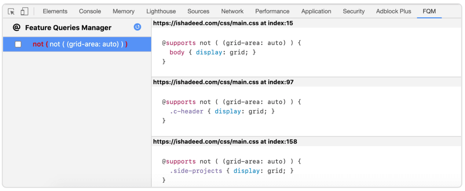
The extension will add a new tab in your browser’s DevTools. On the left, you’ll see a toggleable list of the CSS features nested in @supports queries, and on the right will be a list of every @supports query that uses a particular feature. The CSS shown above is for grid-related stuff. Toggling the checkbox on the left will disable and enable CSS grid. This is a great way to test and break a layout. Let’s get more into the ways to break a layout.
Browser Extensions
Grid Ruler
A great way to test whether two UI elements are aligned correctly is to use a ruler and guides. This can be easily done in design apps such as Sketch, Adobe XD, Photoshop, and Illustrator. In a browser, it’s not possible without an extension.
One great extension, Grid Ruler , is available only in Google Chrome. It enables you to drag and place guides either horizontally or vertically. This is extremely useful for verifying that two elements are aligned correctly.
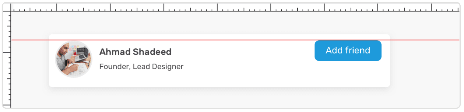
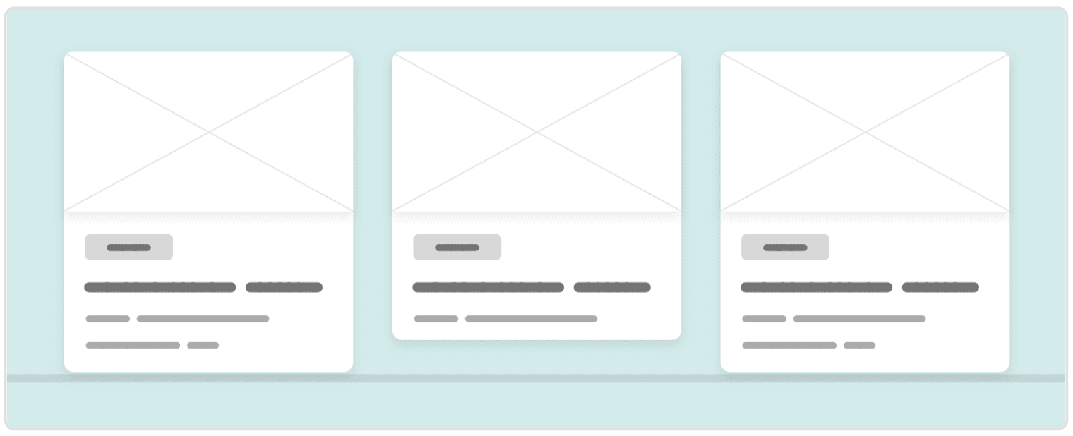
In this mockup, the grid line tells us that the user avatar and the button are aligned.
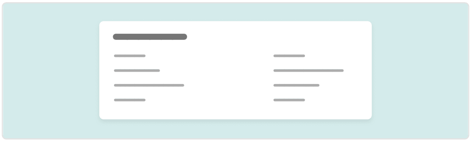
OLI Grid CSS
The OLI Grid CSS plugin is available for Firefox and Chrome. What’s nice about it is that it draws in the page columns, just like in Sketch and Adobe XD. This is helpful for seeing whether the layout you’re working on aligns to the columns.
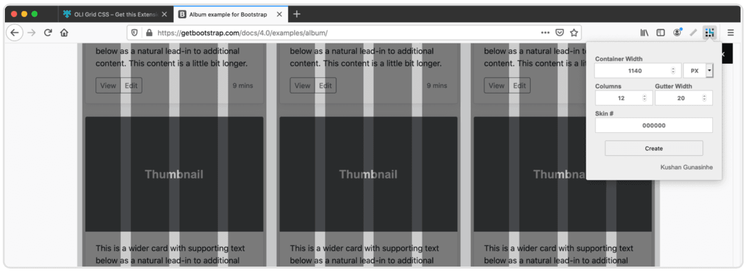
I tried testing the plugin with a Bootstrap-built page, and it works as expected. Note that you need to figure out the width of the .container element of the page first.
Web Developer Extension
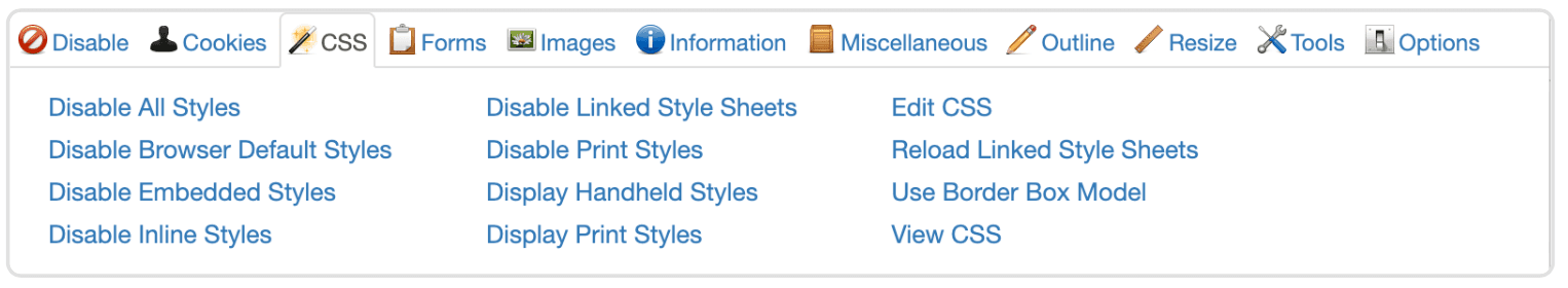
A very useful extension that provides a lot of functionalities to do. Here are some key things:
- Disable all styles
- Disable browser default styles
- Disable inline styles
- Disable print styles
And that’s only a few from the CSS tab!
Pesticide Extension
I explained previously about using the outline CSS property as a way to debug design issues. This blog does the same but in one click only. It adds random colored outlines to every single element on the page, with the ability to highlight a specific element.
Mocking Up in the Browser
There are times when you want to quickly mock up a design idea in the browser by moving a few elements here and there. This is useful for showing a design concept to a developer, client, or designer. Being able to make such edits quickly is important to productivity.
Taking advantage of the browser’s built-in tools, we can do that. In this section, we’ll focus on concepts and examples for mocking up designs quickly in the browser.
Good Ol’CSS Positioning
With CSS positioning, we can edit some elements in the DevTools by adding position to them and placing them where we want. This is a quick way to mock up a design idea while testing for bugs.
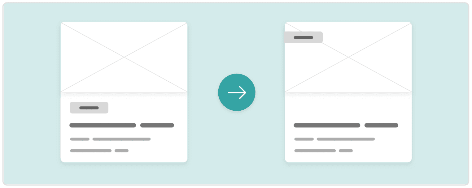
Here we have a card with a category. After some thinking, the designer tells you, the developer, that the team has decided it wants a different position for the category. You suggest that the category could be moved to the upper-left corner. This can be done while you both are on a video call. It’s as simple as adding the following:
.card {
  position: relative;
}
.category {
  position: absolute;
  left: 0;
  top: 16px;
}
This kind of edit, which didn’t take a minute, can allow decisions to happen more quickly.
Hiding Design Elements
As I explained previously, being able to hide design elements quickly, such as with the H key in Chrome, is a useful trick. Doing this, we can hide some design elements and replace them with others, if we want to, for example, take a screenshot of a design concept.
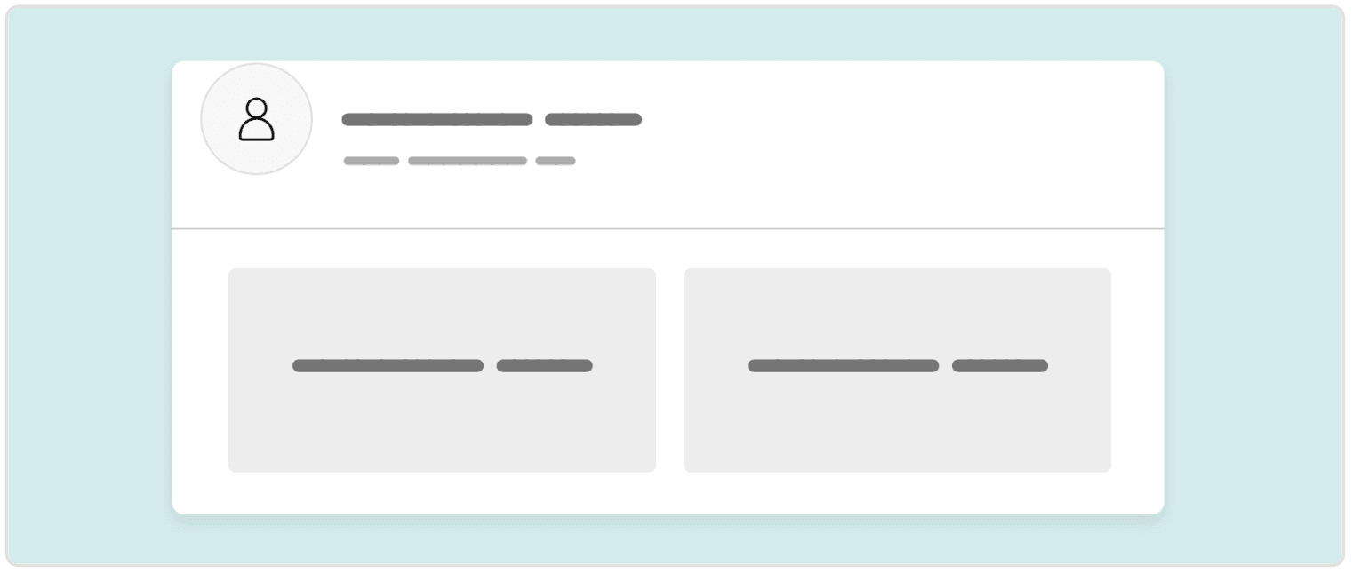
Here we have a section header, which contains a bug that prevents the author’s avatar and name from aligning. The design team has requested that it be removed temporarily. You can quickly delete it from the HTML, hide it with display: none, or use the H key in Chrome.
CSS Flexbox
Using Flexbox, we can quickly make a layout horizontal or vertical. Flexbox properties such as align-items and justify-content are powerful and can accomplish most any design idea you want to show.
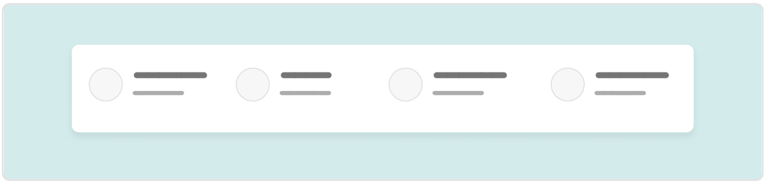
This section header has a row of items. The problem is that the spacing between items is inconsistent. What can we do? The fastest solution is to add display: flex and justify-content: space-between. The design is changed instantly, and all of it happens in the DevTools! You can now proceed to screenshot this change and discuss it with your colleagues.
CSS Grid Layout
This is the most powerful layout module in CSS. Suppose we have a featured news section, and the designer wants to lay out the items in a presentable way — say, as equal-height columns.
We simply use CSS grid to set the columns, and then we confirm with the designer that this is what they want.
.wrapper {
  display: grid;
  grid-template-columns: 2fr 1fr 1fr;
}
Is that still not enough for the designer? You can continue editing and showing them your changes. Moreover, you can try different layout concepts and tie each one to a CSS class, toggling each class in the “.cls” panel.
CSS Viewport Units
We can use viewport units to make a section take up the full horizontal or vertical space of the viewport. We can also use them to size fonts. All of these use cases give us flexibility and make our designs more dynamic.
Suppose we have a hero section that is required to occupy 90% of the screen’s full height. We want to verify the requirement with the designer, so we mock it up very quickly:
.hero {
  height: 90vh;
}
We give the hero section a height of 90vh, which will make it occupy 90% of the screen’s vertical space. We made this edit in less than a minute!
CSS Columns
If we want a quicker method than CSS grid, we can use columns. For example, we could divide links in the footer into two equal columns. We can make this edit with one line of code, and get back to the designer right away.
.footer-section {
  columns: 2;
}
The other good thing about CSS columns is that we can change the number of columns with the keyboard’s up and down arrows.
CSS Filters
Let’s say the designer wants to experiment with a dark mode for the website, but they haven’t done any mockups for it. Using CSS filters, we can quickly whip up a dark mode.
html {
  filter: invert(90%) hue-rotate(25deg);
}
And to polish it, we can revert the elements that shouldn’t have been inverted (such as images and videos):
html img,
html video,
html iframe {
  filter: invert(100%) hue-rotate(-25deg);
}
With that done, we can take a full-page screenshot and show it to the team — all in less than two minutes! Isn’t that cool? With the mockup sent, the team can start thinking and deciding on it. Also, you’ve saved the designer’s time! Making a dark mode for a small web page would take them at least 10 minutes.
Desaturating the Design
Desaturating a page (i.e. converting it into black and white) using CSS filters is a useful trick, for a few reasons:
- If the website you are testing is heavy with colors, your eyes might get tired. Desaturating the page will help you focus on fixing the bug at hand.
- It’s useful for testing and exploration. When the page is saturated, you can easily spot any colors that are not suitable for the design.
- Testing for accessibility becomes easier. Making the page grayscale will let you know which colors are easy to read and which are not.
To desaturate a web page with CSS, open up the browser’s DevTools, select the html or body element, and add the following:
html {
  filter: grayscale(1);
}
That’s all. You now have a black-and-white website!
Wireframe Styling
When mocking up a design, we don’t always have time to choose good colors and fonts. In this case, we can convert the whole web page into a wireframe style using a bit of CSS. This will let you focus on mocking up ideas quickly and getting feedback as soon as possible.
Here is how to do it:
* {
  color: #000;
  background: #ccc !important;
  outline: solid 1px;
}

img,
video,
iframe {
  background: #ccc;
  opacity: 0;
}
Hover for Touch Screens
While debugging on touch devices (phones, tablets, etc.), you might notice some elements change in color or style when you scroll. This is because the :hover style triggers on scroll. This is a problem. The solution is to use the hover media query. According to Mozilla Developer Network :
The hover CSS media feature can be used to test whether the user’s primary input mechanism can hover over elements.
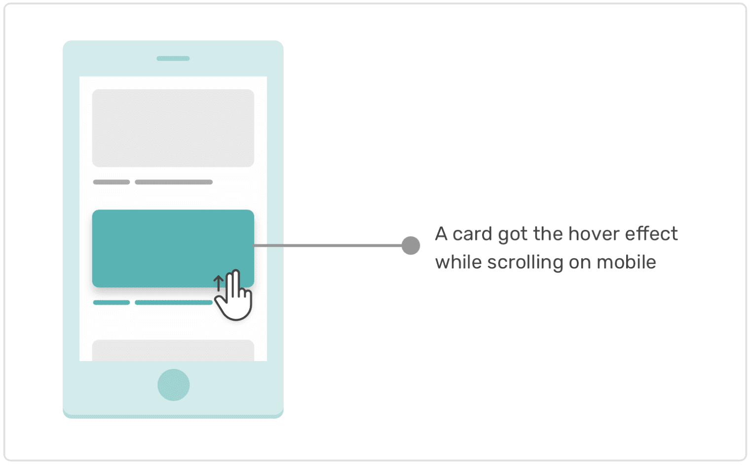
@media (hover: hover) {
  .element:hover {
    color: #222;
  }
}
With this, we prevent :hover styles from triggering for mobile and tablet users. At the time of writing, this feature is supported in all major browsers. The good thing is that when you active device mode in Chrome, it will be considered a touch screen, so you can test the hover media query there.
Using CSS to Show Potential Errors
There is no direct way to display potential errors in CSS. However, some clever folks have devised workarounds that enable us to debug incorrect usage of HTML and CSS. Let’s explore some of them.
Using a CSS Class Out of Context
Let’s say you’ve built a design system with your team, and you want to lint errors related to incorrect usage of a component in the design system. In his methodology named Inverted Triangle CSS (ITCSS), Harry Roberts uses the following classes to create warnings about incorrect usage of CSS classes.
<div class="o-layout">
  <div class="o-layout__item"></div>
  <div class="o-layout__item"></div>
  <div class="o-layout__item"></div>
</div>
The .o-layout class is for an element that acts as a layout wrapper. The .o-layout__item class should only be applied to elements within a parent that has the .o-layout class. The following usage would be incorrect:
<div>
  <div class="o-layout__item"></div>
</div>
The element with the .o-layout__item class shouldn’t live on its own like this. We can debug this very easily:
.o-layout__item {
  /* Show a warning outline by default. */
  outline: solid 5px yellow;
}
.o-layout .o-layout__item {
  /* Remove the outline when item is in .o-layout. */
  outline: none;
}
Also, we can detect whether .o-layout__item is a direct child of .o-layout.
.o-layout > :not(.o-layout__item) {
  outline: solid 5px yellow;
}
Adding width or height Attributes to Elements
Generally speaking, width and height attributes are not recommended for any HTML elements, except img.
:not(img):not(object):not(embed):not(svg):not(canvas)[width],
:not(img):not(object):not(embed):not(svg):not(canvas)[height] {
  outline: solid 5px red;
}
Going further, you can use Gaël Poupard’s browser extension, a11y.css , which shows different advice, warnings, and errors.